Oops! Something went wrong while submitting the form.
How to Build QuickBooks Dashboards: A Practical Guide
Turn QuickBooks and AI dashboards into a living command center by letting an AI computer agent build, refresh, and distribute your financial views for you.
Before you ever plug in an AI agent, QuickBooks dashboards already act as your financial cockpit: revenue, expenses, AR/AP, and cash flow in a single, visual view. The best examples go beyond static reports and tell a story—how your offers perform, which customers drive profit, and when cash will get tight.
For business owners, agencies, and marketers, these dashboard examples are shortcuts to clarity. Instead of guessing which campaigns actually turned into paid invoices, you can line up sales metrics next to QuickBooks revenue, see payback periods, and decide where to double down.
Now imagine never touching the plumbing behind those dashboards again. An AI computer agent can log into QuickBooks and your BI tools, refresh data, clone proven dashboard layouts for each client or business unit, and ship PDF or live links to stakeholders on schedule. You stop wrestling with filters and exports; the agent handles the clicks, the checks, and the chores so you can focus on decisions, not data janitorial work.
How to Build QuickBooks Dashboards: A Practical Guide
1. Traditional, manual ways to build QuickBooks dashboards
If you’ve ever spent a Sunday night exporting CSVs from QuickBooks, this will feel familiar. Manual workflows still matter because they teach you what a "good" dashboard should show before you automate anything.
Method 1: Use native QuickBooks Online Advanced dashboards
Choose a pre-built dashboard like Profitability, Cash flow, Accounts Receivable, or Revenue.
Click Edit to customize: set your date range, choose KPIs (income, expenses, AR aging, AP aging, etc.), and adjust filters like customers, classes, or locations.
Tweak visuals in Setup and Customization: chart type, X/Y axis, and legend.
Save and share by exporting to PDF or granting team access.
Pros: No extra tools, fully supported by Intuit, secure. Cons: Limited layout freedom, manual tweaking for every new dashboard.
Method 2: Export reports and build dashboards in spreadsheets
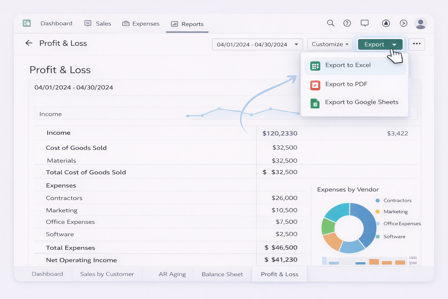
In QuickBooks, open key reports: Profit & Loss, Balance Sheet, Sales by Customer, AR Aging.
Click Export → Export to Excel on each.
In Excel or Google Sheets, clean columns, standardize dates, and create pivot tables: revenue by month, AR by aging bucket, expenses by vendor.
Insert charts (line for revenue, bar for expenses, stacked bar for AR/AP) and arrange them on a “Dashboard” sheet.
Repeat weekly or monthly by re-exporting and pasting new data.
Pros: Highly flexible, works with any BI style. Cons: Extremely manual, error-prone copy‑paste, no real-time data.
Method 3: Build dashboards in BI tools with manual data refresh
Export CSVs from QuickBooks for each key report.
Import them into your BI tool (Power BI, Looker Studio, etc.).
Model the data: map date fields, normalize customer names, define measures like MRR, churn, or LTV if you’re a SaaS or agency.
Design visuals: revenue trends, cohort charts, AR aging treemaps, top customers by income.
Whenever you need fresh data, repeat the export/import process.
Pros: Beautiful, scalable visuals. Cons: Refreshing data is a grind unless you automate it.
2. No‑code automation with connectors and templates
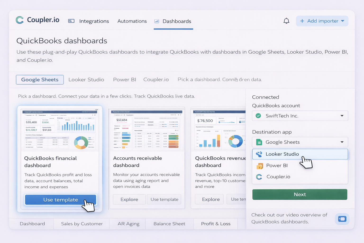
Once you know which KPIs matter, move from copy‑paste to no‑code automation. Tools like Coupler.io, Databox, and Coefficient sit between QuickBooks and your dashboards so data just shows up.
Use their QuickBooks Profit and Loss, Cashflow, Revenue, or AR/AP aging templates.
Connect QuickBooks via Coefficient’s sidebar and map your company file.
Schedule automatic refreshes so your P&L and AR aging always pull live data.
Layer your own formulas (LTV, CAC, cohort analysis) on top of the imported tables and build lightweight dashboards in the same workbook.
Best for: Operators who live in spreadsheets but hate CSV exports.
3. Scaling dashboards with an AI agent (Simular)
Manual and no‑code tools still leave you clicking through UIs. An AI computer agent like Simular Pro can behave like a power user on your behalf: logging into QuickBooks, Coupler, Databox, Sheets, and email, then chaining thousands of steps reliably.
Method 7: Have an AI agent build and refresh dashboards end‑to‑end What it does:
Opens QuickBooks Online Advanced and navigates to Reports → Dashboards.
Applies standardized filters (e.g. last 90 days, specific class/location) for each entity or client.
Logs into tools like Coupler.io or Databox to sync new QuickBooks data.
Exports dashboard PDFs or shares links, then emails them to your stakeholders.
Record or describe a workflow: “Every Monday, log into QuickBooks, refresh the Revenue dashboard, export to PDF, and upload to Google Drive in /Clients/Acme/Reporting.”
Let the agent watch you perform the flow once across the desktop, browser, and cloud apps.
Save that as a reusable "QuickBooks Weekly Finance Pack" workflow.
Pros:
Handles thousands to millions of UI steps with production‑grade reliability.
Works even where there’s no API (e.g. complex custom reports in QuickBooks or niche BI tools).
Transparent execution: every click and keystroke is logged so your finance team can audit it.
Cons:
Requires careful onboarding (access control, test runs with dummy data).
Best suited when you have recurring, standardized reporting needs.
Method 8: Use an AI agent to clone dashboards across clients or entities Agencies and multi‑entity businesses often repeat the same dashboard setup dozens of times.
With Simular:
Teach the agent once how to create a custom AR dashboard in QuickBooks Online Advanced for one company using Intuit’s Create and manage dashboards flow.
Give it a list of company logins or QuickBooks firms.
The agent loops: log into each firm, create the same dashboard, adjust names and filters, and save.
You go from "I’ll get your dashboard set up this month" to "Our AI agent will spin this up across all your entities overnight." That’s the real leverage: QuickBooks dashboards designed by you, executed at scale by an AI computer agent.
Automate QuickBooks Dashboards with AI Agents Fast
Onboard Simular to QuickBooks
Start by defining the ideal QuickBooks dashboard examples you want. Then, install Simular Pro, record one full setup flow, and let the agent learn how you build and update those dashboards.
Test and refine your Simular flow
Run Simular Pro on a sandbox or test QuickBooks company first. Watch each transparent step, tweak filters and timing, and refine until your QuickBooks dashboards are accurate on every run.
Delegate and scale dashboard tasks
Once your Simular workflow is stable, schedule it to refresh QuickBooks dashboard examples for every client or entity, export reports, and distribute links so reporting scales without extra headcount.
Learn how to automate Quickbooks
QuickBooks is a leading small-business accounting platform that centralizes invoices, expenses, cash flow, and reporting, powering rich financial dashboards.


.svg)