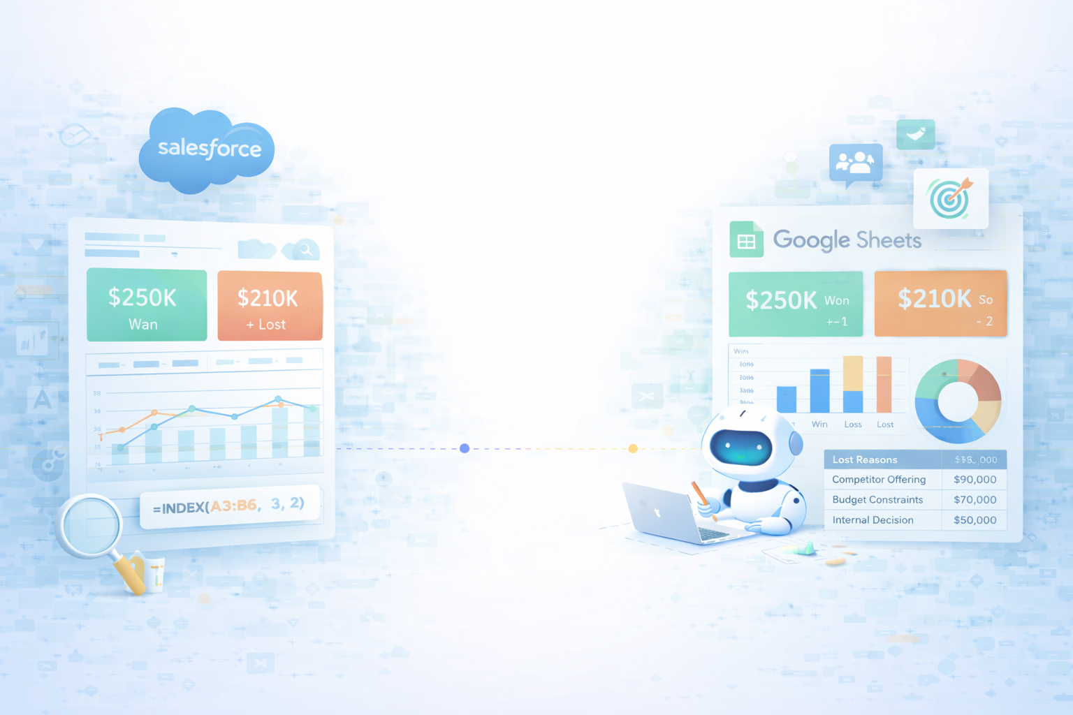
Every sales leader has felt that sinking feeling in QBRs: a wall of anecdotes, a few scattered reports, and no shared answer to the simple question, 'Why did we win or lose?' A win loss analysis dashboard cuts through the noise. By piping opportunity data from Salesforce into Google Sheets, you see win rates by rep, segment, and channel, spot failing playbooks early, and double down on the motions that actually close revenue.
In Sheets you can blend Salesforce with marketing and finance data, test hypotheses in minutes, and share an interactive dashboard that anyone can filter. Instead of debating opinions, your team rallies around visible patterns: which industries convert, which competitors beat you, which stages leak.
Now add an AI computer agent on top. Instead of someone burning hours every week exporting reports, cleaning columns, refreshing charts, and writing commentary, the agent handles the entire loop: logging into Salesforce, updating Google Sheets, recalculating metrics, and even drafting a narrative summary. You get the same rigor of a RevOps analyst, on autopilot, at a cadence you’d never sustain manually.
Here’s how to build and scale a win loss analysis dashboard in Google Sheets, from scrappy manual setups to fully automated AI-agent workflows.
Method 1: Export from Salesforce, analyze in Google Sheets
File > Import to upload the CSV. Docs on importing data: https://support.google.com/docs/answer/40608.=IF(Stage="Closed Won",1,0)=IF(Stage="Closed Lost",1,0)COUNTIF, SUMIF, and AVERAGEIF to calculate win rate, average deal size, and average sales cycle.Insert > Chart and Insert > Pivot table to visualize win rate by rep, industry, and lead source (chart help: https://support.google.com/docs/answer/3093480; pivots: https://support.google.com/docs/answer/1272900).Pros: Total control, deep familiarity with your data, zero extra tools. Cons: Time-intensive, easy to introduce human error, hard to keep updated.
Method 2: Quarterly 'post-mortem' review
Pros: Rich qualitative insight, great for strategic shifts. Cons: Episodic, backward-looking, and reliant on people’s memory.
Method 3: Rep-owned tracking sheet
Pros: Lightweight, encourages reflection, no Salesforce admin changes. Cons: Data is incomplete, dependent on rep discipline, and can drift from CRM reality.
Method 4: Scheduled Salesforce-to-Sheets sync with add-ons Tools like Coupler.io or Coefficient connect Salesforce and Google Sheets without code. The pattern is similar:
You still use native Sheets features – formulas, charts, filter views – but skip the export/import dance.
Pros: Always-fresh data, no CSVs, minimal maintenance, great for RevOps. Cons: Another tool to manage and pay for; customization is limited to what the add-on exposes.
Method 5: No-code alerts and workflows around your dashboard
Pros: Fast feedback loops, proactive pipeline management. Cons: Still requires someone to design and maintain the logic; scripts can silently break.
Once you’ve proven the value of your win loss dashboard, the painful part becomes the busywork: logging into Salesforce, sanity-checking fields, refreshing Sheets, and narrating the story for stakeholders. This is exactly where an AI computer-use agent like Simular Pro shines.
Method 6: Agent as your RevOps assistant
Pros: Offloads the entire mechanical workflow, leverages your existing Salesforce reports and Google Sheets model, no APIs required – it behaves like a human ops analyst. Cons: Requires a clearly documented workflow; first-time setup and testing take some care.
Method 7: Agent-driven storytelling and distribution
Pros: Turns raw dashboards into consistent executive communication, keeps everyone aligned without meetings. Cons: You must review tone and messaging at first; governance around who receives what is important.
The pattern is simple: start with a solid manual Google Sheets + Salesforce win loss dashboard, add no-code sync to keep it live, and then let an AI agent like Simular handle the tedious, cross-app execution at scale while you focus on strategy.
Start simple so your team actually uses it. In Google Sheets, create a tab called 'Deals_Raw' and paste or sync all Salesforce opportunities for a defined period (e.g., last 90 days). Include at least: Opportunity Name, Owner, Stage, Close Date, Amount, Type, Lead Source, Industry, and a Closed Won/Closed Lost flag. Next, add calculated columns: one for win flag (`=IF(Stage="Closed Won",1,0)`), one for loss flag, and optional ones like 'Deal Age' using `=DATEDIF(CreatedDate, CloseDate, "D")`. Then create a 'Summary' tab with sections for company-wide win rate, win rate by rep, by industry, and by source. Use pivot tables based on Deals_Raw so you can slice by any dimension without changing the raw data. Finally, add a small 'Insights' area where, once a week, you (or your AI agent) write 3 bullet points interpreting the numbers. That structure keeps data, analysis, and narrative cleanly separated.
In Google Sheets, the fastest maintainable way is pivot tables. From your Deals_Raw tab, select the full data range and go to 'Insert > Pivot table'. Place the pivot in a new 'WinRate_By_Rep' tab. For Rows, add 'Owner'; for Values, add 'Win flag' summarized by SUM, and 'Opportunity Name' summarized by COUNTA. Then add a calculated field called 'Win Rate' with the formula `='Sum of Win flag' / 'COUNTA of Opportunity Name'`. Format it as a percentage. Repeat the same pattern for Industry, Lead Source, or Deal Size Bucket by changing the row field. If you prefer formulas, you can use `=SUMIF(OwnerRange, "RepName", WinFlagRange) / COUNTIF(OwnerRange, "RepName")`, but pivots are easier to maintain and visualize. Once built, your AI agent or no-code sync tool just refreshes the underlying data, and these win-rate views stay current automatically.
The right cadence depends on your sales cycle, but there are useful defaults. For fast-moving SDR and SMB teams, daily refreshes keep coaching and channel optimization tight. For enterprise motions with long cycles, weekly may be enough. If you’re manually exporting from Salesforce, pick a consistent day and time (e.g., every Monday morning) and treat it like a ritual. With no-code connectors or an AI agent, schedule more frequent updates – even hourly if leadership watches the board actively. The key is alignment: tell your team how 'fresh' the dashboard is supposed to be, and design decisions around that. If you introduce Simular, you can let it run updates off-hours, so every morning the Google Sheets dashboard reflects the prior day’s changes without anyone touching a CSV.
Quantitative metrics explain where you’re winning or losing; qualitative reasons tell you why. Start by ensuring Salesforce has fields like 'Primary Loss Reason' and 'Competitor'. If that data is patchy, add a column in Google Sheets called 'Reviewed Loss Reason' where sales leaders refine or correct entries after listening to calls or interviewing prospects. Create a pivot table grouped by Reviewed Loss Reason and Competitor to see patterns at a glance. Then add a separate tab, 'Stories', where you log 5–10 representative deals with columns for Deal ID, Reason, Competitor, and a short narrative of what happened. Link those Deal IDs back to the raw data with the `HYPERLINK` function. This gives you both aggregate charts and real stories. An AI agent can help by scanning new closed-lost deals, flagging missing reasons, and prompting reps or managers to fill the gaps before the dashboard refresh.
Treat your AI agent like a new RevOps hire: start supervised, then graduate to autonomy. First, document the exact clicks and steps a human takes to refresh the win-loss dashboard: which Salesforce report they open, what filters they set, how they export, where they paste into Google Sheets, and how they check for obvious errors. Configure your Simular agent to follow that script, and use its transparent execution view to watch every action during early runs. Limit scope at first (e.g., only last 7 days of data, no destructive edits). Once you trust it, schedule the agent via webhook or internal pipelines so it runs at fixed times. Keep protected ranges and version history enabled in Sheets so you can instantly roll back mistakes. With that guardrail approach, you get the benefit of hands-free, multi-step automation without sacrificing control or data integrity.