
Oops! Something went wrong while submitting the form.
.svg)
Every sales leader has lived this scene: it’s Monday, your CEO wants an updated pipeline, and your “dashboard” is a patchwork of CSV exports, VLOOKUPs, and guesswork. Deals slip, stages are mislabeled, and by the time the report lands in Slack, it’s already stale.
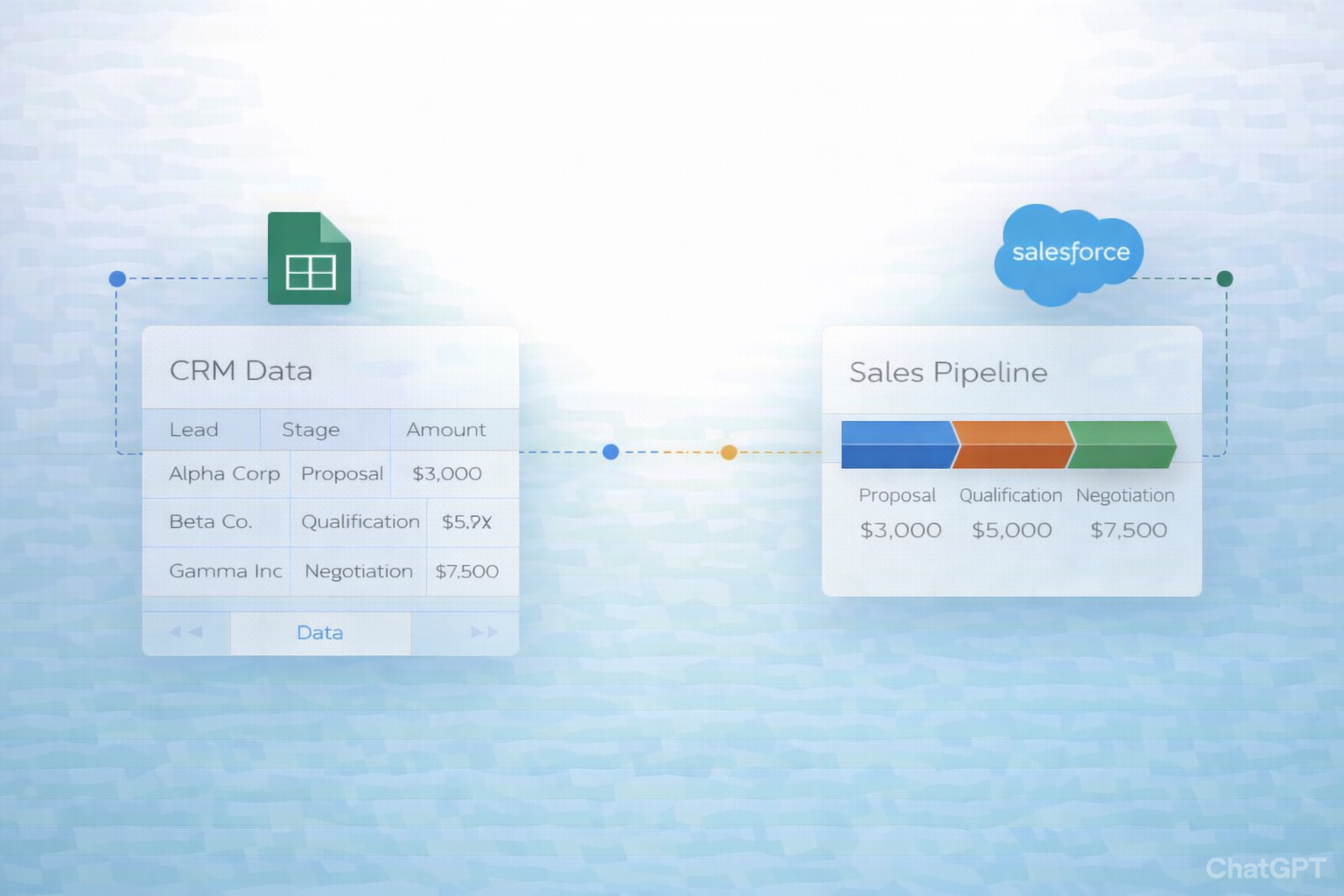
Sales pipeline visualization fixes that. When you map opportunities into clear stages and timelines, you see reality at a glance: where cash will land, which reps are stuck in proposal purgatory, and which segments are quietly exploding. Google Sheets and Salesforce together give you flexible modeling and reliable source-of-truth data. You can segment by rep, region, product; run what‑if scenarios; and share a single, live view with marketing, finance, and leadership.
Now imagine an AI computer agent handling the grunt work. Instead of spending hours exporting, cleaning, and reformatting, the agent logs into Salesforce, updates your Google Sheet, rebuilds charts, and flags weird trends before your standup. You stay focused on coaching, strategy, and closing, while the agent quietly keeps your pipeline mirror‑clean and always current.
If your sales pipeline still lives in a patchwork of tabs, screenshots, and last week’s exports, you’re flying blind. Let’s walk through three levels of pipeline visualization—from fully manual to fully automated with AI agents—so you can choose the path that fits your team today and grow into tomorrow.
Sales Pipeline.Deal Name, Company, Owner, Stage, Amount, Close Date, Probability, Source.Prospecting, Qualified, Proposal, Negotiation, Closed Won, Closed Lost.Stage into a dropdown tied to that list. Docs: https://support.google.com/docs/answer/186103Stage as deals move.Pros: Simple, zero setup cost, great for tiny teams or agencies just starting. Cons: Error-prone, completely manual, and goes out of date the second someone forgets to update their rows.
Weighted Amount = Amount * Probability (e.g., =C2*G2).Stage, Values to Sum of Amount and Sum of Weighted Amount.Now you have a visual of total and weighted pipeline by stage.
Open status.Pros: No extra tools needed. Cons: Every insight costs you another export; leadership sees lagging information.
At this stage you stop being the human ETL pipeline and let integrations keep Sheets in sync.
You can use official connectors or marketplace add-ons to sync opportunity data.
Opportunity object and select fields: Name, Owner, StageName, Amount, CloseDate, Probability, LeadSource.SF_Opportunities.Now your raw data tab updates without exports. Your existing pivot tables and charts on top of that tab update as the data refreshes.
Pros: Near real-time pipeline, less manual effort, no code. Cons: Still need to design your dashboards and manage formulas; complex changes require a power user.
Dashboard tab.=FILTER() and =QUERY() to slice data per rep, segment, or quarter. Docs: https://support.google.com/docs/answer/3093343View only sharing for execs: https://support.google.com/docs/answer/1218656
Pros: Custom views that CRMs often can’t match; everyone can self-serve. Cons: Still fragile; someone can break formulas, and you still babysit structure as needs change.
This is where you stop being a spreadsheet admin and start orchestrating an AI co-worker.
Imagine this: every Monday at 7am, an AI agent:
With Simular’s computer-use agent (via Simular Pro), you can script this as a multi-step desktop workflow:
SF_Opportunities tab.
Pros: No more manual refreshes; works across desktop, browser, and cloud apps exactly as a human would. Cons: Needs a bit of upfront configuration and testing.
Beyond updating visuals, your AI agent can act like a junior revenue operations analyst:
Negotiation > 30 days.Risk & Alerts and highlights rows.Pros: You stop hunting for problems; your pipeline literally tells you where to look each morning. Cons: Requires clear rules and some iteration so the alerts are signal, not noise.
You can even delegate scenario planning:
Scenario_Optimistic, Scenario_Base, Scenario_Pessimistic.Probability or Amount based on each scenario’s rules.Pros: Strategic scenarios at the speed of thought; you focus on decisions, not number crunching. Cons: Needs governance so people don’t get confused by too many versions.
By climbing this ladder—from manual Sheets, to no-code automations, to fully delegated AI computer agents—you turn pipeline visualization from a painful chore into a reliable, always-on system that quietly scales with your revenue.
